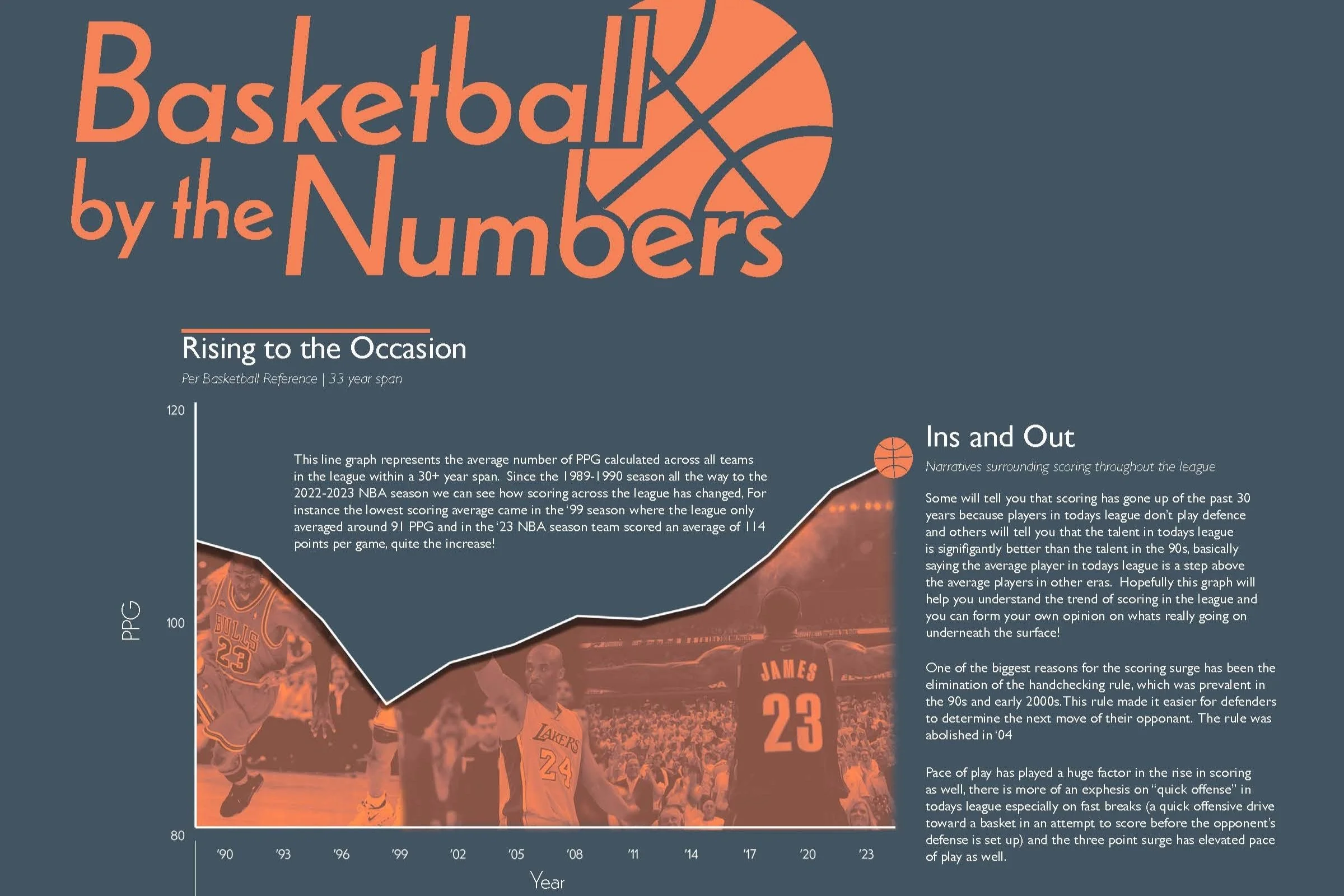
Basketball by the Numbers
Data Visualization Poster
April 2023 - May 2023This data visualization poster aims to explore how scoring in basketball has evolved across multiple decades by highlighting key statistical trends such as average points per game, shooting efficiency, three-point adoption, and pace of play. Through visually engaging graphics, the poster will reveal how changes in play style, league rules, and player skill sets have shaped the game’s scoring landscape over time. The ultimate goal is to provide a clear, data-driven narrative of basketball’s scoring evolution for fans, analysts, and sports enthusiasts.
My for this project is utilize 3 different graphs for each data set and determine which type of graph was best fit to showcase the chosen data. This poster shows 3 data sets relating to the NBA over the past 30+ years being league scoring average, 3 pointers attempted and made, and finally top scoring teams from the ‘90 season and top 3 teams from the ‘23 season.
Typography.


Graph Exploration.

Line Graph.
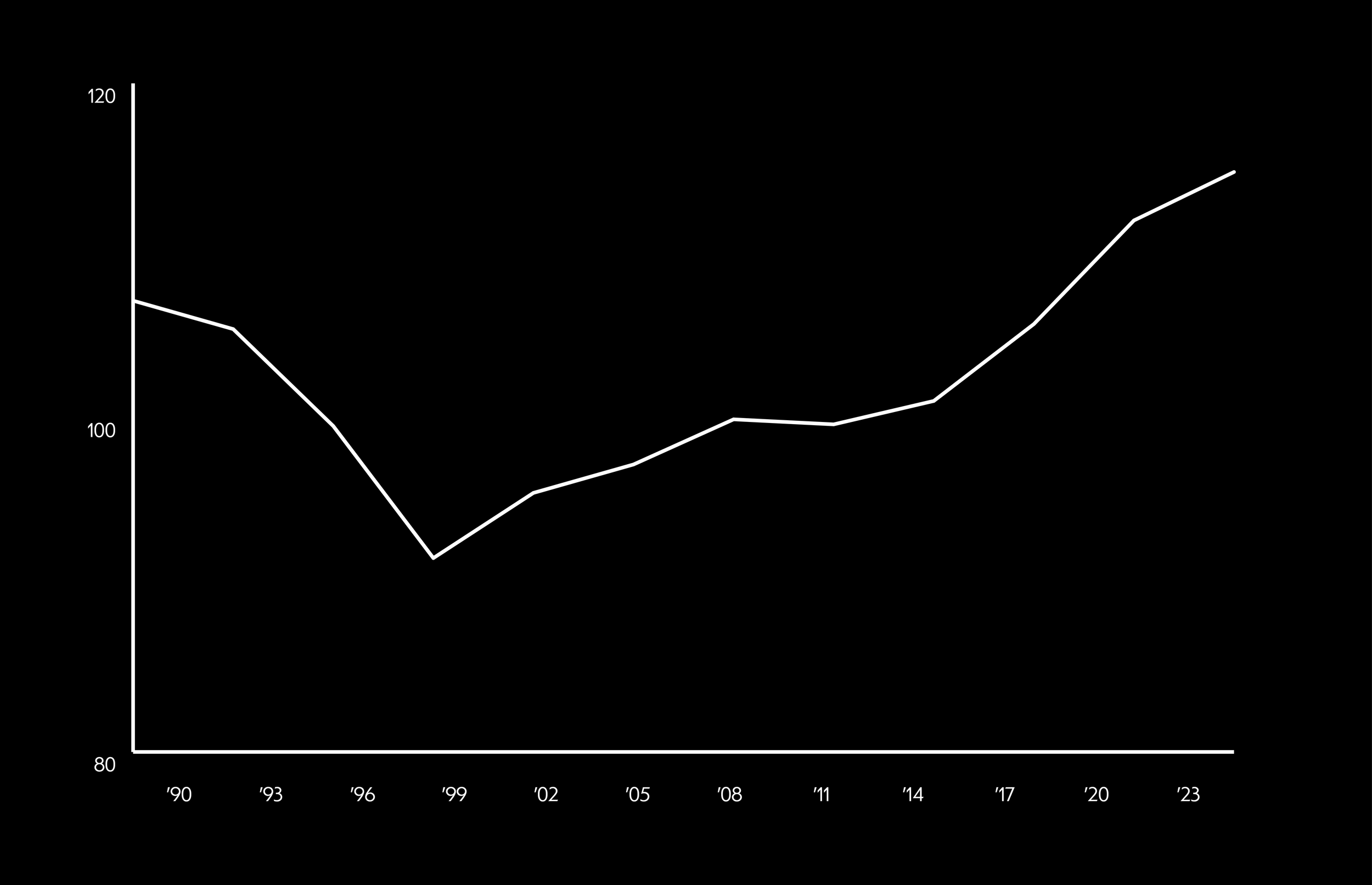
The first graph and “main attention” in this poster is the league scoring average over the past 30 years. A line graph felt the most appropriate for this poster because it can it effectively illustrates trends and changes over time. Its continuous, connected lines make it easy to track fluctuations in scoring averages, highlighting patterns such as gradual increases, sharp rises, or periods of stability. This graph makes it easy to follow how the game has evolved over the past couple decades
Scatter Graph.
The second graph in this poster is 3 pointers both made and attempted through the 90s 2000s and 2010s including a couple years in the 2020s. It clearly shows the relationship between three-pointers attempted (X-axis) and three-pointers made (Y-axis) over time. Each dot represents a specific season, allowing for easy identification of outliers or significant shifts in shooting trends.
Bar Graph.
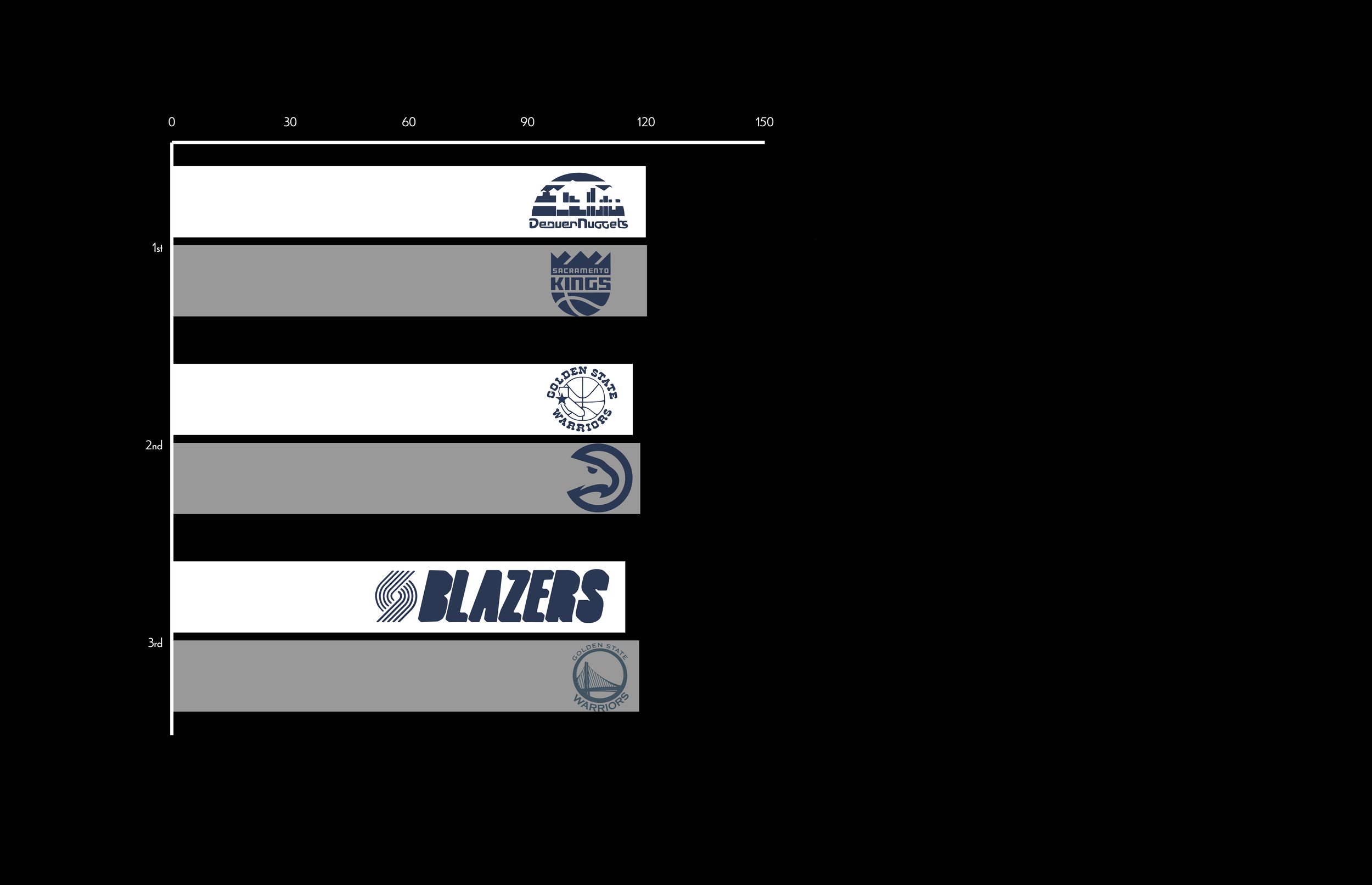
The third graph in this poster is a bar graph comparing the top 3 teams, in terms of scoring, from the 1990 season and the 2023 season. A bar graph felt the best and easiest in showing a clear comparison between the older team and a newer team. The logos represent the team from the 90s and the teams from today, using the older logo for the 90s team and the modern logos for the ‘23 teams.